Posts by Alyson Shane
The Top 5 Link in Bio Services for Social Media
- by Alyson Shane
One of the biggest challenges to converting your social media followers into customers is directing them to your website. This is why you may have noticed people using the expression “link in bio” on platforms like Instagram.
Today we’re going to talk about what the phrase means, how you can use it to direct more traffic to your website, and some tools to help make that easier.
What Does “Link in Bio” Mean?
The phrase originated on Instagram back when the platform only allowed users to add urls in their (you guessed it) bios.
As a result, people started saying “link in bio” in their Instagram captions to let readers know where they could go to buy something, read a blog post, or contact them.
Some companies also use the #LinkInBio hashtag to reinforce the message - here’s an example:
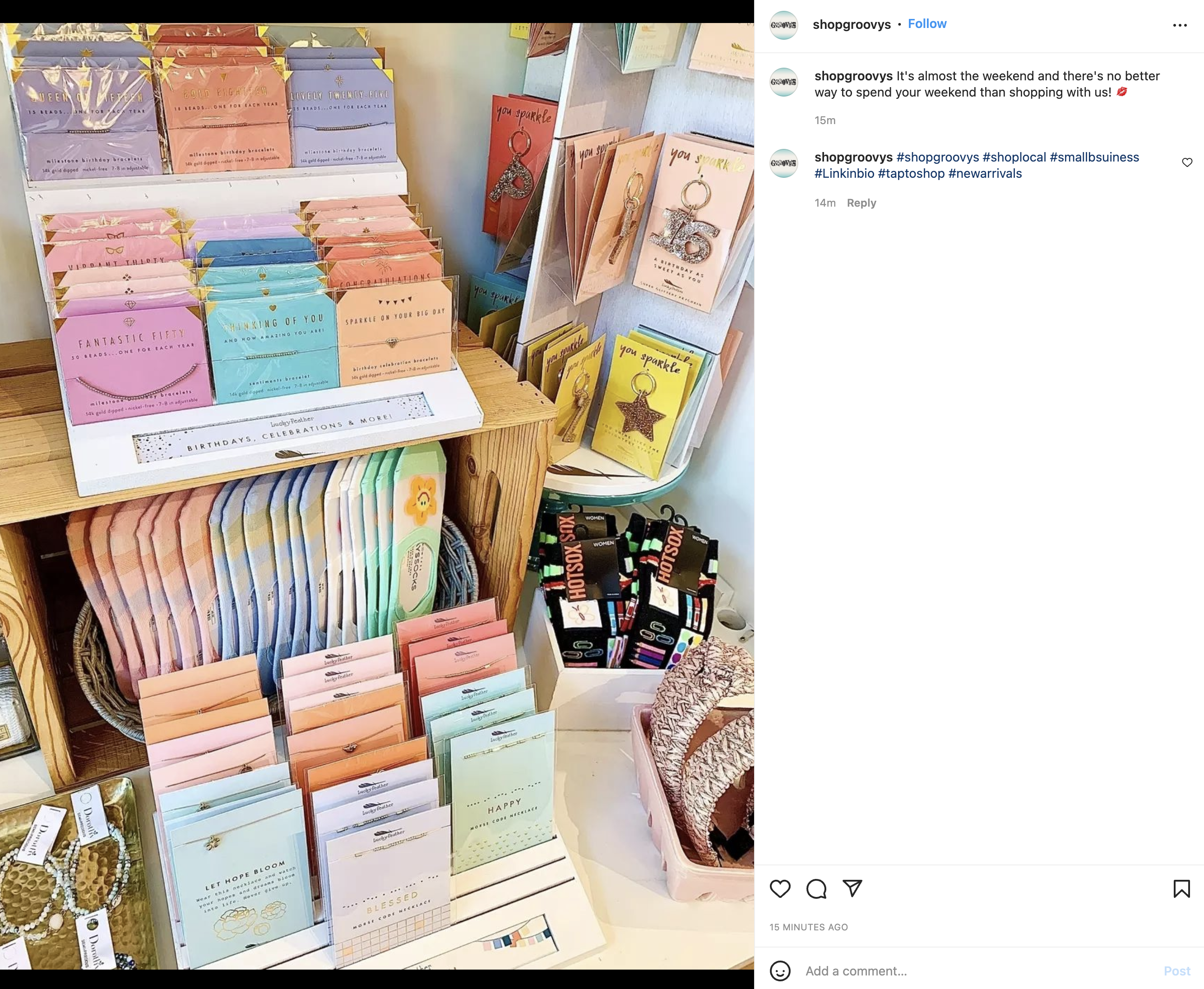
Nowadays Instagram allows users to add links in a few places, like as a Stories sticker or through Instagram Shopping tags, but the “link in bio” feature is still one of the most powerful and popular ways to direct users to your site.
It’s not just for Instagram, either: “link in bio” is popular on TikTok, Twitter, and even YouTube as well.
What’s the Benefit of a Link In Bio Tool?
The reason a link in bio tool matters for your business is because it doesn't just direct people to your website — it also allows you to create a custom landing page within the app that directs people to multiple urls.
Here’s what a link in bio tool looks like on our Instagram profile:

This one link directs our audiences to a landing page with a bunch of different links to our latest blog posts, calls-to-action to book an audit, sign up for our newsletter, and get in touch:
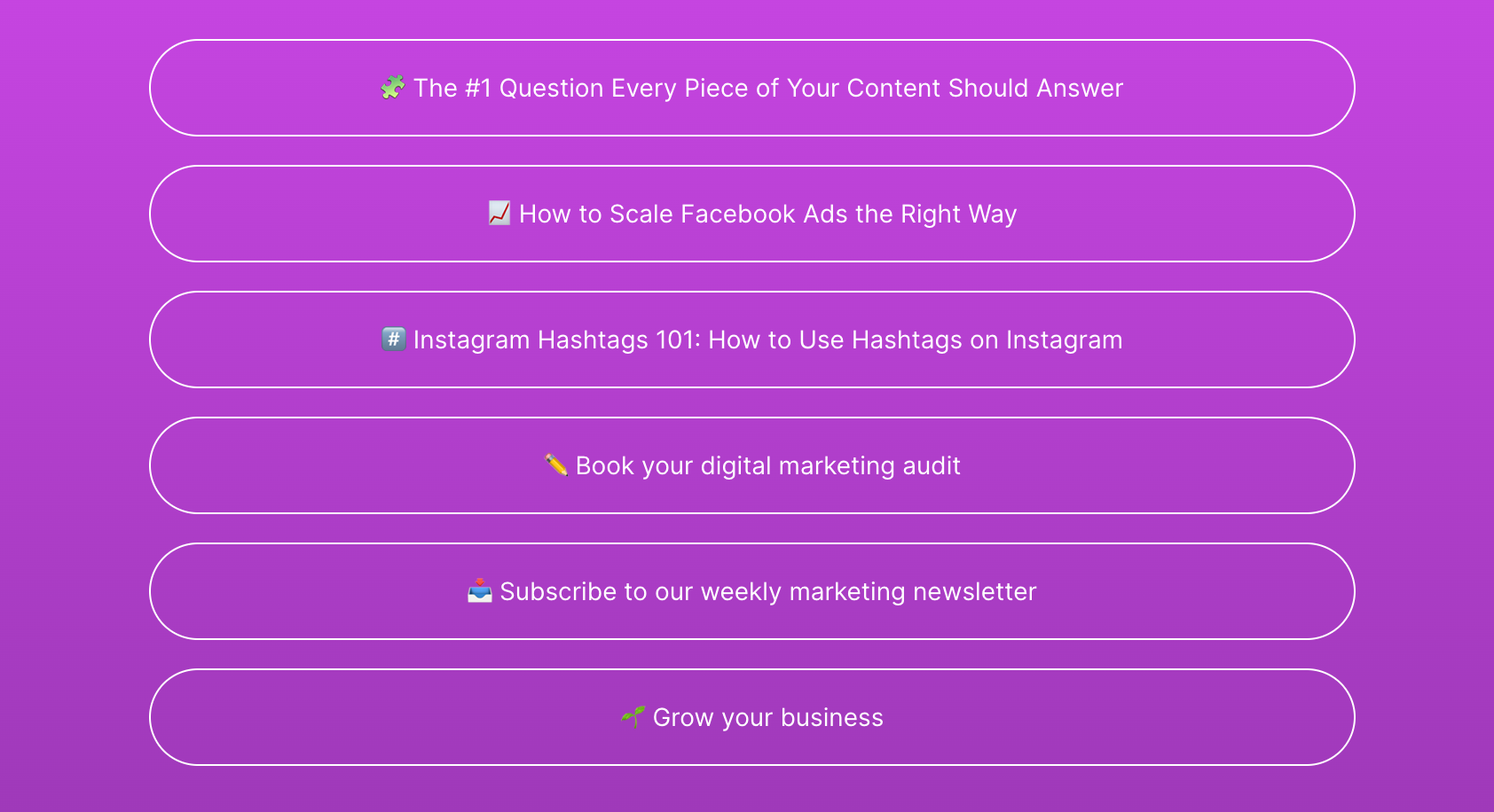
As you can see, a link in bio tool doesn’t just send people to your website, it allows you to strategically showcase high-priority links to your target audience and make it easy for them to click.
That being said, not all link in bio tools are created equally! Some offer simple interfaces, while others create mini-sites within the social platform for users to browse.
With literally dozens of options to choose from it can feel overwhelming to try and pick the right one for your needs, which is why we’ve done the leg work for you and collected this roundup of the best-in-class options:
The Top 5 Link In Bio Tools
1. LinkTree
As you may have noticed in the example above, our link in bio tool of choice is LinkTree.
LinkTree was the tool that made this kind of service popular in the first place, and turns a single link into a landing page with clickable buttons to showcase your most important content.
LinkTree also has a ton of great features, including one that allows you to “Prioritize” a link by adding an action to it, like a wobble or a swipe, to draw people’s attention to it:
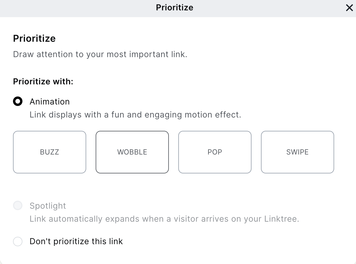
LinkTree also allows businesses and creators to accept payments and donations, has great analytics, and is easy to edit, update, and integrate with tools like MailChimp and Facebook. Some other features include:
- Unlimited links
- Customizing colours, fonts, and button styles
- Retargeting using the Facebook Pixel
- Timing links to go live with scheduled posts (we love this feature!)
Cost: Free with limited features with Pro plans starting at $6 per month.
2. Linkin.Bio by Later
Later is one of the most popular Instagram scheduling tools on the market, so it’s no surprise that they’ve also gotten into the link in bio game.
Later’s Linkin.bio tool turns a single link into a mini-website for your business where you can showcase products and other content without the user ever leaving the app.
Here’s an example of how Later’s linkin.bio looks:
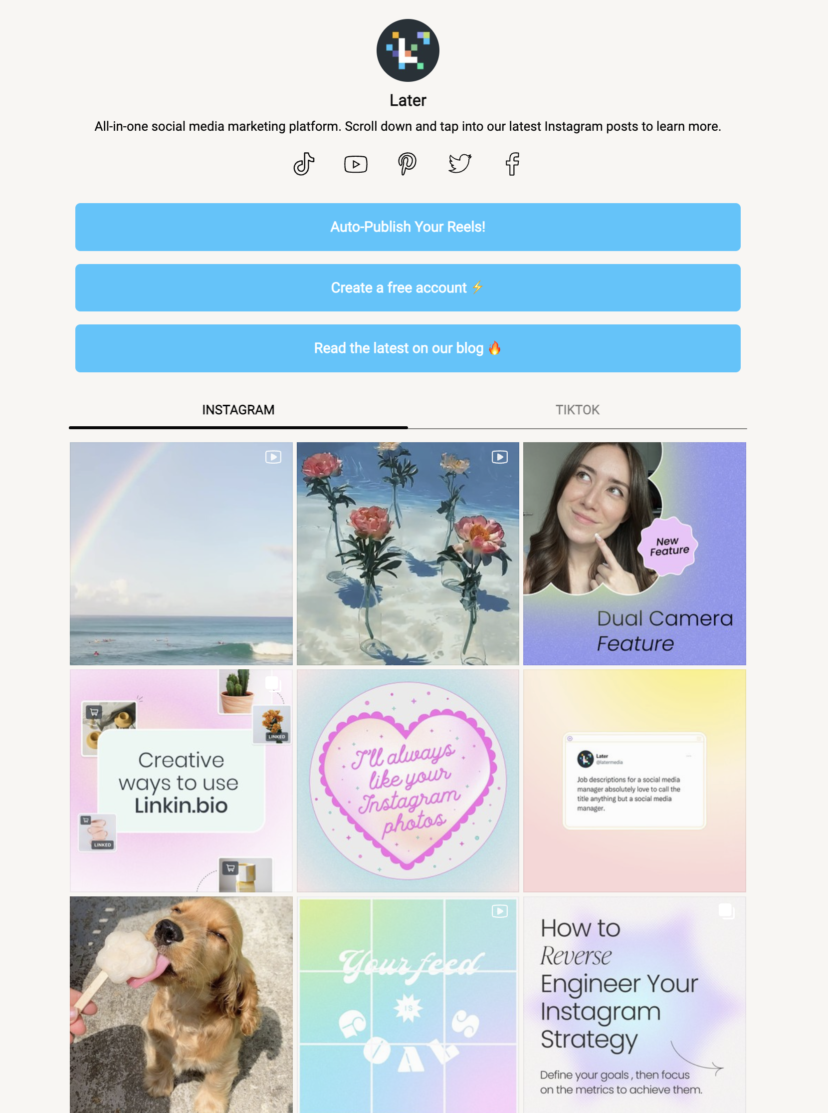
When users click on your bio link they’ll get taken to a recreation of your Instagram feed, but now when they click on a post they’ll be able to click the link you wanted to insert into that post.
Some other features include:
- Adding links to your feed
- Adding up to five links per post
- Scheduled links (like LinkTree does)
- Analytics and link tracking
- Up to two Instagram accounts
Cost: Later’s Free Forever plan is (obviously) free, and paid versions start at $15 per month.
3. Sked Link
Sked Link is a tool from the company Sked Social, and allows you to link your followers to newsletter signups, blog posts, products, and lots more.
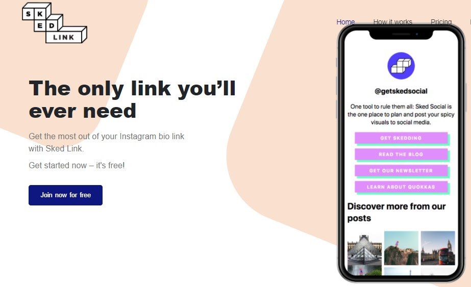
This tool offers a few pricing plans with various features, from Basic, Pro, or Enterprise. Some of the features included in the Basic and Pro plans include:
- Choosing from custom or existing themes
- Integrating with Google Analytics and Facebook Pixels
- Link analytics
- Customizing your UTM parameters
Cost: Starts at $25 a month and goes up from there, but offers a free seven-day trial.
4. Shorby
Shorby creates mini landing pages and pulls content from any RSS feed that you connect it to. It’s a cool service because you can include content pages, prices, and even lists of services.
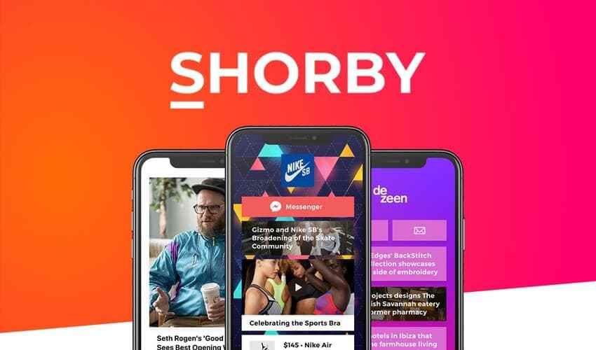
Image via 99signals
The pages you can create with Shorby are mobile-friendly and come packed with lots of features including:
- Adding videos, backgrounds, animated avatars, and icons to your page
- Adding text blocks, gifs, and rich links
- Robust analytics
- The ability to cross-link to other social profiles
- Retargeting audiences through websites like Amazon and Clickbank
Cost: Pricing ranges from $9 to $99 a month, and offers a free five-day trial so you can check it out before committing to a plan.
5. Milkshake App
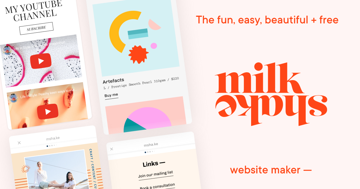
The Milkshake App lets you build mini sites within Instagram like Shorby does, but has some cool features that make it stand out, including:
- Sharing your mini-site to your Instagram Stories
- Customize and add themes to your cards (the pages on your mini-site)
- Analytics and follower insights
- Giving users the option to email you directly (great for ecommerce!)
- Inviting followers to call or message you directly
Cost: Free for iOS and Android users.
Start Converting More Followers Today
Using a link in bio tool is just one part of the puzzle when it comes to turning your social media followers into customers - you also need a content strategy, hashtag research, and lots more.
If you’re looking for help building a marketing strategy, drop us a line and let’s chat about how we can help.
How to Scale Facebook Ads the Right Way
- by Alyson Shane
Facebook Ads have been a “must” for almost every business over the last several years thanks to its robust and detailed targeting options that allow you to show your ads to your target audience.
But what do you do if you feel like you’ve hit a ceiling with your Facebook Ads return-on-investment (ROI)? What other tactics can you use to extend your reach and help your ads get shown to even more of your ideal customers?
Keep reading to find out:
How to Scale Facebook Ads the Right Way
There are two main ways you can scale your ads: through your budget, or through your audience targeting.
Let’s start with how to scale your budget
Option 1: Increase your budget
This probably comes as no surprise, but one of the easiest ways to get more out of your Facebook Ads is to increase how much you’re spending.
This sounds simple, but scaling your budget on Facebook isn’t the same as other platforms like Google or Bing Ads.
(Also: if you’re looking for a team with 20+ years’ experience running pay-per-click ads like Google and Bing, let’s chat.)
But back to Facebook: every time you change your Ads budget, the algorithm that decides who sees your ads changes, too. If you change your budget mid-campaign you run the risk of resetting the Learning Phase (Facebook’s way of saying “we’re figuring out what to do next”).
Generally speaking, the guidelines for scaling is to keep all budget changes within 20% or less of the original budget. Here’s a video that digs into the “why” in deeper detail, but for the sake of this post we’ve summarized it into a handy chart:
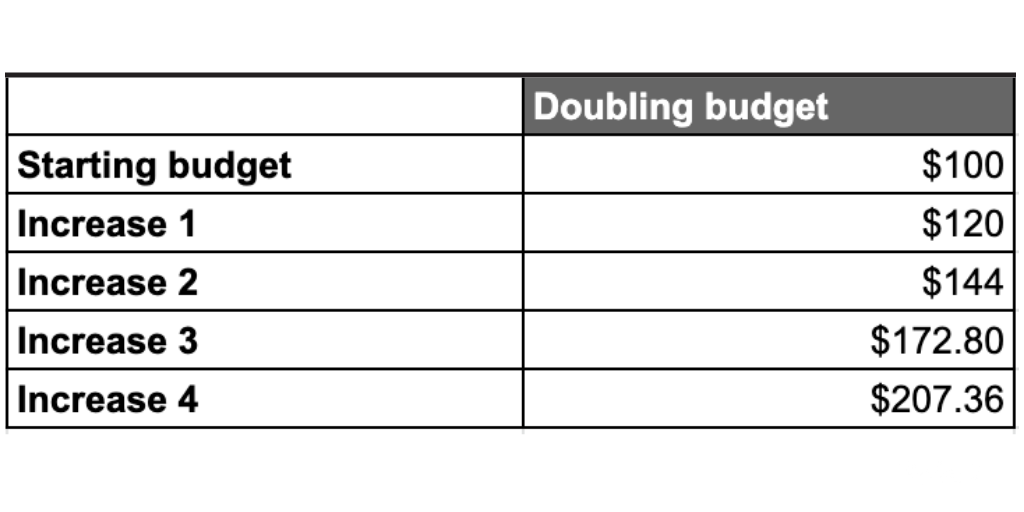
The above applies to both daily and lifetime budgets (we prefer lifetime budgets since you don’t run the risk of maxing out your daily limit and missing out on potential Impressions).
Option 2: Extend Your Targeting Into “Lookalike” Segments
If you’re looking for a way to scale your campaign beyond just the budget, consider expanding your targeting into audiences that are similar (but slightly different) than the audiences you’ve already targeted.
One way to do this is to target audiences who like similar products or services.
For example, if you’re a small business selling personalized children’s stuffed animals, create a new target audience of people who Like the Business Pages of stores in your area that carry gifts, furniture, and items for babies and new families.
The way we described above is one way to do it, but another way to take the guesswork out of things and let Facebook’s algorithm do the heavy lifting by creating Lookalike Audiences.
Lookalike Audiences are exactly what they sound like: they’re groups of people who “look like” your target audiences. You can set them up easily just by following these steps.
Another way to lean into using Lookalike Audiences is to create “seed” audiences of people with similar attributes to people who meet this criteria:
- People who have added products to their cart
- Newsletter subscribers
- People who filled out a lead gen from
- High-value customers
Option 3: Go After the Competition
A rising tide floats all boats, but why leave customers on the table when you could make them aware of your products and services, too?
To do this, see if you can set the competitor up as a targeting option.
This will likely only show up for larger brands, but you don’t have to be a big brand to attract customers from a larger competitor (in fact, when most people realize there’s a local option they choose to buy from that business, instead).
Option 4: Use Affinity Brand Audiences
Similar to competitor brands, “affinity brands” refer to brands that your customers also buy from.
Let’s use the “stuffed animals” example from above, if we’re trying to target audiences of people who would be interested in baby gifts and products we can target audiences of people who have visited websites about parenting, baby food, diaper, and other related topics.
Option 5: Test With Broad Targeting
“Broad targeting” is when you create a Facebook Ads campaign focused on the conversion action you want more of… then you leave the rest up to the Facebook algorithm.
If that sounds dicey, we know! That’s why this option has a caveat: only test with this option if you already have high volumes of the desired conversion action.
Aka, in order for this option to work, you need at least 100 desired conversions happening per week. Otherwise Facebook’s algorithm won’t have enough data to make smart decisions on your behalf.
Start Scaling Your Facebook Ads Today
These are some high-level strategies to scale your Facebook Ads results and generate an even better return-on-investment (ROI) on your ads, but there are all sorts of individual strategies that can be applied on a per-business basis.
If you’re ready to start getting more out of your Facebook Ads, drop us a line and let’s chat.
Instagram Hashtags 101: How to Use Hashtags on Instagram
- by Alyson Shane
Hashtags are one of the most effective ways of connecting your Instagram posts to your community, customers, and target audience.
In this post, we'll show you how to use hashtags to attract new followers, engage with your audience, and build brand awareness so you can grow your business.
What’s a hashtag?
A hashtag is a word, acronym, or a phrase used with the pound symbol (#) in front of it.
When you click on a hashtag you’ll be shown all the post on that platform that use the same hashtag — this is how you “connect” your posts to larger collections of content and discussions around a specific idea or theme.
Hashtags started on Twitter, but can now be found on most social media platforms including:
- Twitter (obviously)
- TikTok
Why use Instagram hashtags?
While the platforms listed above use hashtags, Twitter and Instagram are the platforms where hashtags are the most important. Some of the benefits of using hashtags include:
- Increasing engagement. Instagram posts that use hashtags see a 12.6% increase in engagement than those that don’t.
- Expand your reach. Hashtags make your posts, Reels, and Stories easier for people to find (this is known as “discoverability”) which helps you content be seen by a larger audience.
- Attract new followers. Hashtags help your posts get seen within niche groups, which means using them can result in more Instagram followers who have the potential to become customers.
- Improving brand awareness. Hashtags play an important role in helping your brand express its “voice” and build trust and familiarity with your audience.
How to add hashtags on Instagram
Adding a hashtag is super simple! Here are a few tips to help make it even easier:
- Don’t use punctuation. Hashtags are all one word — don’t use spaces or punctuation (eg: #ThisIsRight, vs. #This-Isnt-Right)
- Use title case. Capitalizing the first letter of each word makes it easier for people to read your hashtag, and makes your hashtags more accessible since screen readers are much more likely to read the hashtag as intended vs. reading it as one, long and jumbled word.
- Don’t repeat your hashtags. Using the same hashtag twice in the same post doesn’t help discoverability, so stick to using one hashtag one time per post.
- Double-check before using a hashtag. Some hashtags might be associated with inappropriate content or content that isn’t right for your brand, so always take a look at how other people are using it.
Types of Instagram hashtags
There are several different kinds of hashtags that you can use on Instagram, including:
- Location hashtags. These hashtags connect you with your local community and help you get in front of potential customers nearby. Some examples include:
- #ExploreMB
- #TorontoLife
- VancouverIsland
- Popular hashtags. These hashtags tend to be super broad because lots of people use them. As a result, they’re not great for connecting with a specific niche, but can help your brand be seen by a broader audience. Some examples include:
- #ThrowbackThursday
- #PetsOfInstagram
- Trending hashtags. These hashtags are usually related to a specific event or theme and are super-popular for a shorter amount of time. These could include:
- #Superbowl2022
- MarchMadness2022
- Branded hashtags. These are exactly what they sound like! They’re hashtags that are specific to a brand or a marketing campaign. Some examples include:
- #ShareACoke by Coca-Cola
- #TweetFromTheSeat by Charmin
How many hashtags to use on Instagram?
Instagram allows you to use up to 30 hashtags in a post, and while most advice says to use around 10, research from Later shows that 20-30 hashtags for Feed posts are actually optimal. Here’s what they suggest:
- 20 hashtags for optimal reach
- 30 hashtags for optimal engagement
How to hide Instagram hashtags
Let’s face it: 20-30 hashtags is a lot. Below are some of our favourite ways to hide them so they don’t make your post look clunky:
- Add them as a comment. This has been the tried-and-true method for years. Just write your post caption and then add a comment with the hashtags you want to include.
- “Push” them down. Once you’ve written your caption, create new lines with just a period after each line to create “white space” that buffers your post caption from the hashtags.
- Cover them. This is a great way to use multiple hashtags in an Instagram Story post. Add your hashtags, then make the hashtag tex the same colour as your background or cover them with a sticker.
How to use hashtags on Instagram
As we’ve seen, hashtags are a powerful tool to help you promote your Instagram content to your ideal customers and target audience. Here are some ways to inject some strategy into your hashtag use:
Treat hashtags like keywords
Keywords are how websites optimize for SEO, and on Instagram, hashtags take the place of keywords.
Here at Starling Social we use a “blended hashtag strategy” which is exactly what it sounds like: it’s a blend of lower and higher-volume hashtags that help our client’s posts be seen by the widest possible audience.
Here are some examples:
- Broad, low intent: #nailsalon, #eyebrowthreading
- Less broad, medium intent: #eyelashtechnichan #browbarwinnipeg
- Specific, high intent: #browswinnipeg, #lasheswinnipeg
Save a list of “default” hashtags
While you shouldn’t repeat the same hashtags in a single post, you can repeat hashtags that work in different posts.
Here at Starling Social, we create a hashtag strategy document that lists the best hashtags to use that are organized popularity, relevance, and categorized by topic. This helps us go always choose the most strategic hashtags, no matter what the post is about.
Create your own hashtag campaigns
Some of the most widely-known campaigns have been hashtag-based. A great example is the #IceBucketChallenge which raised awareness for ALS and raised $115 million.
The trick here is to get your followers to want to use your hashtag, which means it needs to be something related to your business or the campaign you’re currently running.
Create a branded hashtag
As we discussed earlier, branded hashtags are a great way to generate awareness and encourage user-generated content (UGC) which is when other people include your hashtag in their content.
For example, we helped the Manitoba Museum come up with the branded hashtag #MyMBMuseum which they’ve used in campaigns, giveaways, and encouraged visitors to use when checking out exhibits at the museum.
Not sure how to create your own branded hashtag? Here are some tips:
- Make it unique. Be specific and include your brand name.
- Make it easy to remember. Long hashtags are easy to forget and can be annoying to type out, so make it short and snappy.
- Research it. Check the hashtag you’re considering to make sure it’s not already being used, or (even worse) being used for something insensitive or inappropriate.
Use hashtags for giveaways
One of the easiest ways to track entries in a contest (which can get overwhelming if you have lots of entries) is to use a hashtag associated with the contest. Not only does this make it easier for you to track entries, but you can repurpose any UGC it generates for your own feed!
Use other branded hashtags
If you’re looking to support or cross-promote with another brand, or think their followers would be interested in your content, then don’t be afraid to use their branded hashtag.
Follow hashtags
Instagram allows you to “follow” hashtags on the platform, so make sure you’re following these groups:
- Your branded hashtag. Staying on top of engagement related to your brand is critical, so make sure to follow your branded hashtag, if you have one.
- Your competitor’s hashtags. This allows you to keep tabs on them on the DL.
- Industry hashtags. This allows you to stay in-the-know about the latest trends and news in your niche.
- Geo-location hashtags. Following hashtags for your geographic area allows you to see content from people (aka, potential customers) in your city or region.
To follow a hashtag, just click the “follow” button in your search results.
Start using hashtags on Instagram
Hashtags are one of the most powerful tools at your disposal to grow your presence on Instagram. Use them to increase your reach, grow your follower count, and generate buzz about your business.
Looking for professional help with your Instagram strategy? Drop us a line and we’ll develop a plan that’s custom-fit for your business.
45+ Headline Examples to Drive Clicks to Your Website
- by Alyson Shane
Let’s be honest: very few of us actually sit down and read every piece of content that comes across our screens every day. If we did, that’s all we’d do!
In fact, research shows that 81 percent of people only skim the content they read online, which makes writing strong, attention-grabbing headlines critical to getting people to click on your content.
That’s why today we’re doing a deep-dive on how to write scroll-stopping headlines across a variety of use cases — let’s get to it:
How to write a great headline?
A great headline should appeal to its intended audience and get them to click to find out more. How it does this will depend on the context in which the headline is being used.
For example, a blog post title should explain what the reader will get out of the article before they start reading.

Google Ads headlines need to make the offer clear and entice someone to click right away:

That being said, there are some basic headline writing strategies that apply no matter what the headline is being used for, which include:
Write with an “active voice”
Most of us tend to write with a “passive voice” which is when the subject is the focal point in the sentence, and “active voice” happens when the subject does the action that’s being described.
Here’s an example:
Passive voice
- Users get warned about misinformation on the platform by Facebook
Active voice
- Facebook warns users about misinformation
Use unusual words
The more unusual words you can use, the more your headline will stand out. Instead of using commonly-used words like “better”, “great”, and “faster”, choose synonyms that stand our a little bit more.
Here’s an example:
Generic
- 5 Great Calls-to-Action for Your Website
Unusual
- 5 Unbeatable Calls-to-Action for Your Website
Notice how the word “unbeatable” stands out more because we’re not used to seeing it in this context? Try applying this trick to your headlines!
Ask questions
Headlines written as questions make readers feel like we’re having a conversation with them, which is more engaging than even using an “active voice”.
Questions are also a great way to keep our headlines short and snappy while grabbing people’s attention. Take a look at these examples:
- Should your business be on TikTok?
- What is Content Decay? (and How to Fix It)
- Organic vs. Paid Traffic — What’s the Difference?
Write headlines for your audience
One of the easiest ways to get people to click on your headline is to make sure they know it’s intended for them.
When writing your headlines, ask yourself: what do these people want? Why do they care about my product or content? Writing your headlines with these questions in mind helps you be more specific, which makes your copy more impactful.
Check out these examples:
- 10 Instagram Trends Every Digital Marketer Should Know
- Example App: The #1 Tool for HR Leaders
- Here’s Why Event Creators Choose PromoApp
Communicate value right away
No matter where your headline is being read, it’s important to make the benefits of clicking on it clear to your reader right away.
Whether it’s important information, a discount, or something that will help them save time, make sure to lay this out as clearly as possible in your headline.
Here’s a few examples:
- 10 Website Conversion Tips to Capture More Leads
- Facebook Ads in 2022: How to Lower Your Ad Costs
- How to Prevent and Avoid Migraine Triggers
Make emotional connections
People are more likely to click on a headline that triggers an emotional response.
In fact, ads with purely emotional content perform twice as well (31% vs. 16%) compared to those with only rational content. Here are a few examples:
- How to Take Command of Your Next Meeting
- TGIF: 12 Ways to Treat Yourself After Working Hard All Week
- How to Wow Your Clients With Your Next Marketing Report
How to write homepage headlines
The easiest way to write a headline for your home page is to write a few and choose the one you like best, then A/B test which versions perform best.
The most important thing to keep in mind when writing home page headlines is that it needs to march your brand voice. Think about it: your website probably isn’t the first time someone has interacted with your brand — they probably saw you on social media or found you through a Google search — so you want this to be a seamless brand experience.
Some ground rules include:
- Stick to a similar tone
- Use the same vocabulary (write for an 8th grade reading level)
- Include familiar sentence structure
Website homepage headline examples
Now that we’ve covered the basics, here are a few examples to get you going:
- Introducing _____
- The New Approach to _____
- _____, Staring at Just $_____
- Refresh Your _____
- A Fresh Approach to _____
- Meet Your New _____
- The #1 _____ for [your audience]
- The Best _____ for [your geo-location]
How to write blog headlines
A great blog post title catches a reader’s attention, tells them what they’ll get out of the article, and encourages them to click and learn more.
Luckily, you have lots of opportunity to convey that messaging: a 2020 study by SEMrush found that headlines between 10 and 13 words can double your traffic and increase social shares by 1.5x compared to headlines with seven words or less.
If this sounds like a lot of work, don’t worry: a study from Orbit Media found that most content marketers only draft two or three headlines per post.
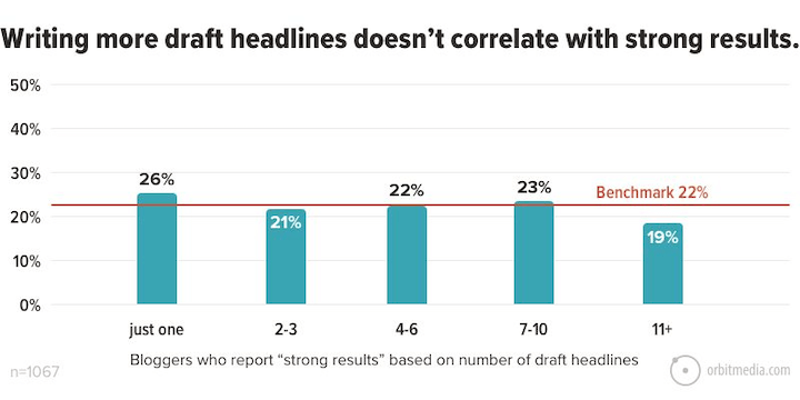
Image via OrbitMedia
Blog headline examples
The trick to writing effective blog headlines is to start with the purpose of your post and your audience in mind. Ask: what is the clearest and more interesting way I can state what this post is about?
If you’re still stuck, try using some of these headline examples to get started:
- _____ Tips From Experts on _____
- Everything You Need to Know About _____
- _____ Examples to _____
- How to _____ When You _____
- How to _____ in [Time Frame]
- _____ Ways to Start Doing _____ Today
- How to _____: Best practices
- What is _____? (And How to [Solve/Fix/Do] It)
- How _____ Can Help Your Business
- _____ Ways to Improve _____
How to write Google Ads headlines
An effective ad headline needs to convey enough information that people will want to click on it, without giving everything away before they click.
Before we get too deep into Google Ads headlines, let’s talk quickly about something you should understand: response search ads.
What are responsive search ads?
Responsive search ads are a Google Ads format that can “blend” elements of pre-written headlines and descriptions to create ads that are “responsive” to a user’s search query.
With traditional ads, you create a single, static ad, but with responsive ads you can write up to 15 different headlines and up to four different descriptions which can be arranged in over 43,600 ways!
Google will automatically test different combinations of headlines and descriptions to figure out which work best together, so over time your responsive ads will show the more relevant message to users depending on what they’re searching for, their browsing history, and other defining characteristics.
Responsive ads best practices
Now that we’ve covered what a responsive ad is, let’s discuss some of the basics:
- You can write up to 15 different headlines, so we suggest at least 10
- Headlines need to be shorter than 30 characters, but we suggest varying up headline lengths (at least a little bit) since Google can sometimes show as many as three headlines
- Switch up your headlines so some include your target keywords, while others highlight benefits, features, and other elements that drive clicks
Google Ads headline examples
Since we have multiple headlines to work with it’s important to be creative and have lots of variety. Here are a few examples to get you started:
- _____ in [your geo-location]
- Voted Best _____ of 2022
- Find Your _____
- Get Your Quote Today
- The Best _____
- _____% Off Your Purchase
- [Your brand] vs. [your competitor]
- Free Shipping
- Try 30 Days Risk-Free
- Save With _____
How to write Facebook Ad headlines
Facebook ads should be short and to the point, with emphasis on the images or visual assets instead of the copy itself.
According to research from Adspresso, the average length of a Facebook Ads headline is five words — meaning you need to get to the point as quickly as possible.
Facebook Ad character limits
One of the most important things to remember when writing your ads is that you don’t want your text to truncate (when it’s too long and gets cut off with a “...”) — this makes your messaging unclear and can reduce the number of people who click on the ad.
With this in mind, here are the latest limits to keep in mind for Facebook Ad text:
Facebook Feed ad character limits
- Text: 125 characters
- Headline: 25 characters
- Link description: 30 characters
Facebook Stories Ad character limits
- Text: 125 characters
- Headline: 40 characters
Facebook Carousel Ad character limits
- Text: 125 characters
- Headline: 40 characters
- Link description: 20 characters
Facebook Right column ad character limits
- Headline: 40 characters
Facebook Instant Article Ad character limits
- Headline: 40 characters
- Primary text: 125 characters
- Description (images): 30 characters
Facebook Marketplace Ad character limits
- Text: 125 characters
- Headline: 25 characters
- Link description: 30 characters
Facebook Ad headline examples
Here are some examples to get you started:
- Order Now to Get _____
- Save _____ on _____
- Start Your Free Trial Now
- Do _____ With Confidence
- Accomplish _____ With _____
- Gift the Gift of _____ This [holiday]
- Sign Up for _____ Today
How to write LinkedIn Ad headlines
Just like with Facebook, LinkedIn ads show the image or video first, with the copy being secondary. The most common types of LinkedIn Ads are single-text ads and promoted content posts where you can use up to 70 characters in your headline.
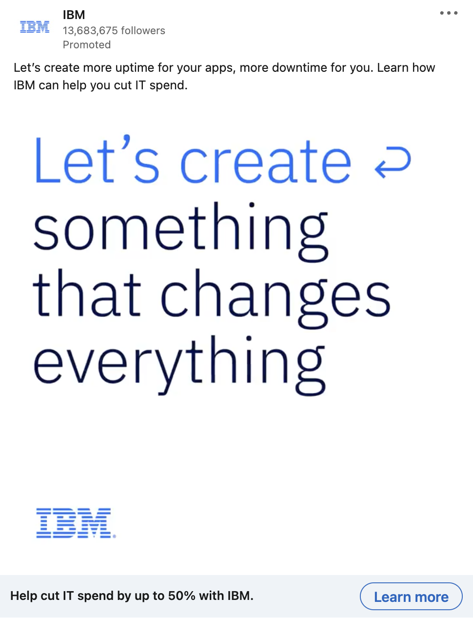
As we can see, the headline appears below the image and the ad text, which means the goal is to reinforce the message conveyed in the image and encourage people to click.
LinkedIn Ad character limits
Just like Facebook, you don’t want your text to truncate and muddle your messaging so you’ll want to keep character counts in mind.
That being said — LinkedIn offers a lot more options for ad types (Message Ads, Video Ads, etc.) that don’t specifically have headlines, so the list below includes only LinkedIn ad types that have headline requirements:
LinkedIn Single Image Ad character limits
- Name of ad (optional): Up to 225 characters
- Introductory text: Up to 150 characters
- Headline: Up to 70 characters to avoid shortening (but can use up to 200 characters)
- Description: Up to 100 characters to avoid shortening (but can use up to 300 characters)
LinkedIn Carousel Ad character limits
- Name of ad: Up to 255 characters
- Introductory text: Up to 150 characters to avoid shortening on some devices (255 total character limit)
- No more than two lines in each card’s headline text
- Character limits: 45-character limit on ads leading to a destination URL; 30-character limit on ads with a Lead Gen Form CTA
LinkedIn Follower Ad character limits
- Ad description: Up to 70 characters
- Ad headline: Choose a pre-set option or write up to 50 characters
- Company name: Up to 25 characters
LinkedIn Spotlight Ad character limits
- Ad description: Up to 70 characters
- Ad headline: Up to 50 characters
- Company name: Up to 25 characters
- CTA: Up to 18 characters
LinkedIn Lead Gen Ad character limits
- Form name: Up to 256 characters
- Headline: Up to 60 characters
- Details: Up to 70 characters to avoid truncation (Up to 160 characters total)
- Privacy policy text (optional): Up to 2,000 characters
LinkedIn Ad headline examples
Since our LinkedIn Ad headlines need to support the heavy lifting happening in the image and text sections of the ad, we want our headlines to be clear and to-the-point.
Try these out:
- Start _____-ing Today
- Introducing _____: Learn More
- Try Our _____ Today
- Request Your Demo Today
- The _____ You Need to Get the _____ You Want
- Grow Your Business With _____
- The Only _____ You’ll Ever Need
Use these headline examples to get more clicks
Headlines can be hard to write — but they don’t have to be! By leaning on the examples we listed in this article you’re already on your way to creating headlines that are on-brand, packed with information, and are more likely to capture clicks from your target audience.
If you’re still struggling to write scroll-stopping headlines, we’d love to help! Drop us a line and let’s chat.
And hey, if you liked this article and to get a roundup of articles like it (from us and other forward-thinking companies) delivered to your inbox every Tuesday morning, subscribe to our weekly digital marketing newsletter.
4 Social Media Design and Branding Tips From Our Designer
- by Alyson Shane
Within a few seconds of landing on your profile, your visitors will decide whether or not they want to follow or subscribe. Most of that decision lies in your online visual identity and how it relates to your brand. Is your content visually appealing? Is it something your audience wants popping up in their feed?
Here are some tips for creating and curating a social media presence that is visually engaging, reflective of your brand and strengthens your visitors’ relationship to you and helps build your brand’s online community.
- Choose the best channels for your audiences
- Curate your content to the platform
- Consistency and cohesion are key
- Create Templates
- Colour and Typography
- Follow Basic Design Principles
- Visual Hierarchy
- Contrast
- Balance
1. Choose the best channels for your audiences
Sometimes it seems like every day there’s a new platform out there. It can be hard to keep up. It’s important to remember your branding goal and not get distracted.
Each platform has its pros and cons. Thanks to analytics and metrics, we have a pretty good idea of who is using them. With that, we can provide a better idea of where to focus your energy.
What platform best works as an extension of your brand? Where are your customers spending their time?
Good branding needs authenticity and so sometimes it’s good to stay in your lane.

2. Curate your content to the platform
Once you’ve chosen your platforms, be sure your content fits the platform. Instagram reels and TikTok videos are meant to be watched on a phone and should be shot vertically. Alternatively, Facebook and Youtube Videos are meant to be filmed and watched in a more traditional horizontal layout.
Size is also important. Instagram images tend to be more square whereas images on Twitter tend to be more wide than tall.
Lastly, consider the type of content that is being put out. Where you might create a long-form explainer video for Youtube, your instagram stories need to be short and to the point.

3. Consistency and Cohesion are Key
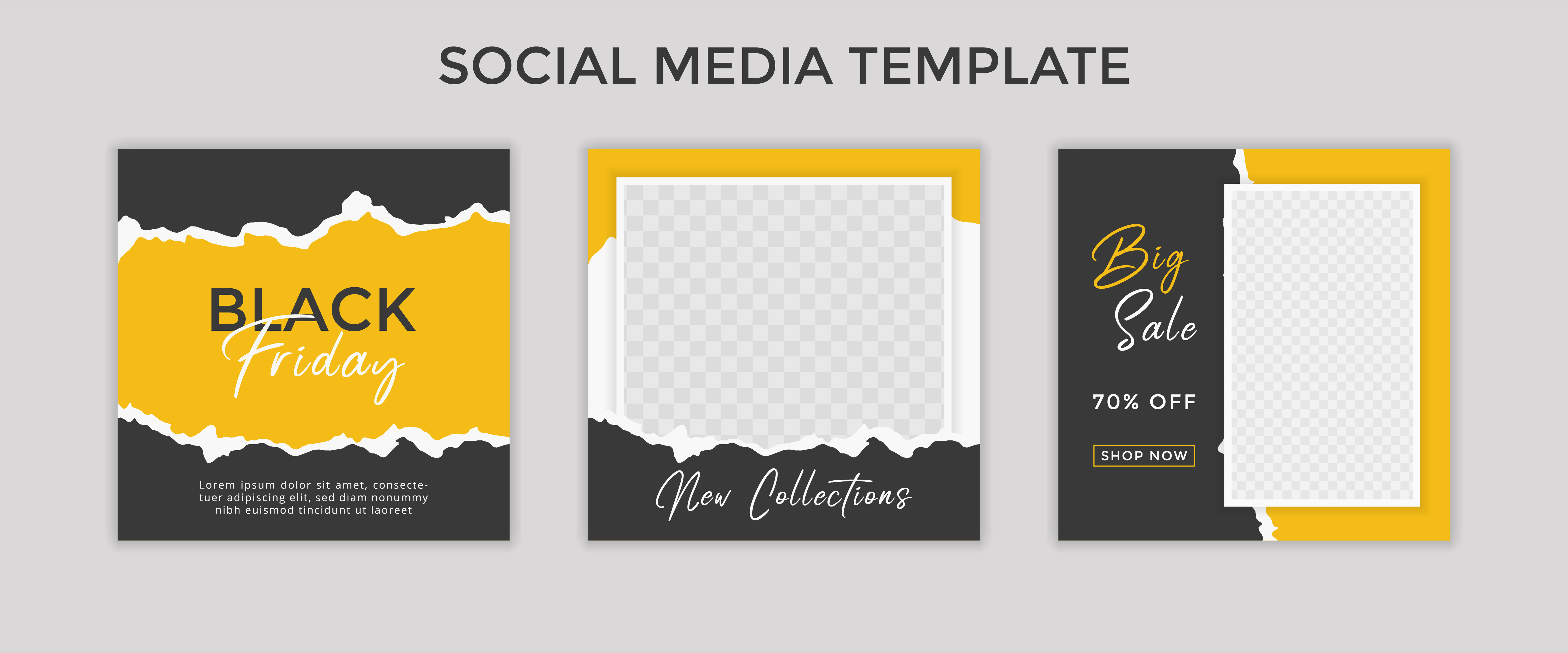
Social Media is competitive, your little post is up against a seemingly never-ending stream of content. It can be a challenge to stand out. Creating templates and guidelines for content helps create a consistent recognizable presence and there are some great options online to help.
Your posts don’t all have to look identical, but a recognizable theme throughout is important. Think of your posts as siblings and not identical twins.
Find a cohesive look is easier when using similar styles, colour palettes and typography.
Courtesy of Adobe Stock
Here are some things to consider:
- Typography. If you already have an established brand guideline, try to stick to your existing chosen typography. If not, choose two or three fonts that work with your branding and use those throughout your visuals. Avoid using too many fonts in one visual. This lets your message be the focal point rather than the medium. Typically serif fonts are best for print and sans-serif for web, but that’s not a hard-fast rule.
- Colour. Colour sets the mood, creates an atmosphere. In fact, most snap judgements in marketing are based on colour alone, so choose wisely and find something that reflects your brand persona.
Similar to typography, you want to choose two or three brand colours and use them throughout your visuals. If I say “Support the Blue and Gold” and you think of the Bombers, that’s thanks to consistent visuals.
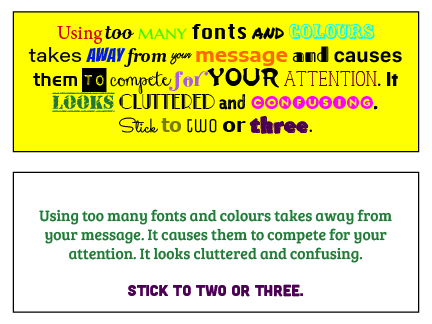
Remember, we are in the business of writing content, not ransom notes.
4. Follow Basic Design Principles
By following three key design principles, you can ensure your content is clear and engaging.
Visual Hierarchy
You may only have a few seconds to get your audience’s attention. Visual hierarchy is a way of laying things out by order of importance. Here are some ways to achieve good visual hierarchy:
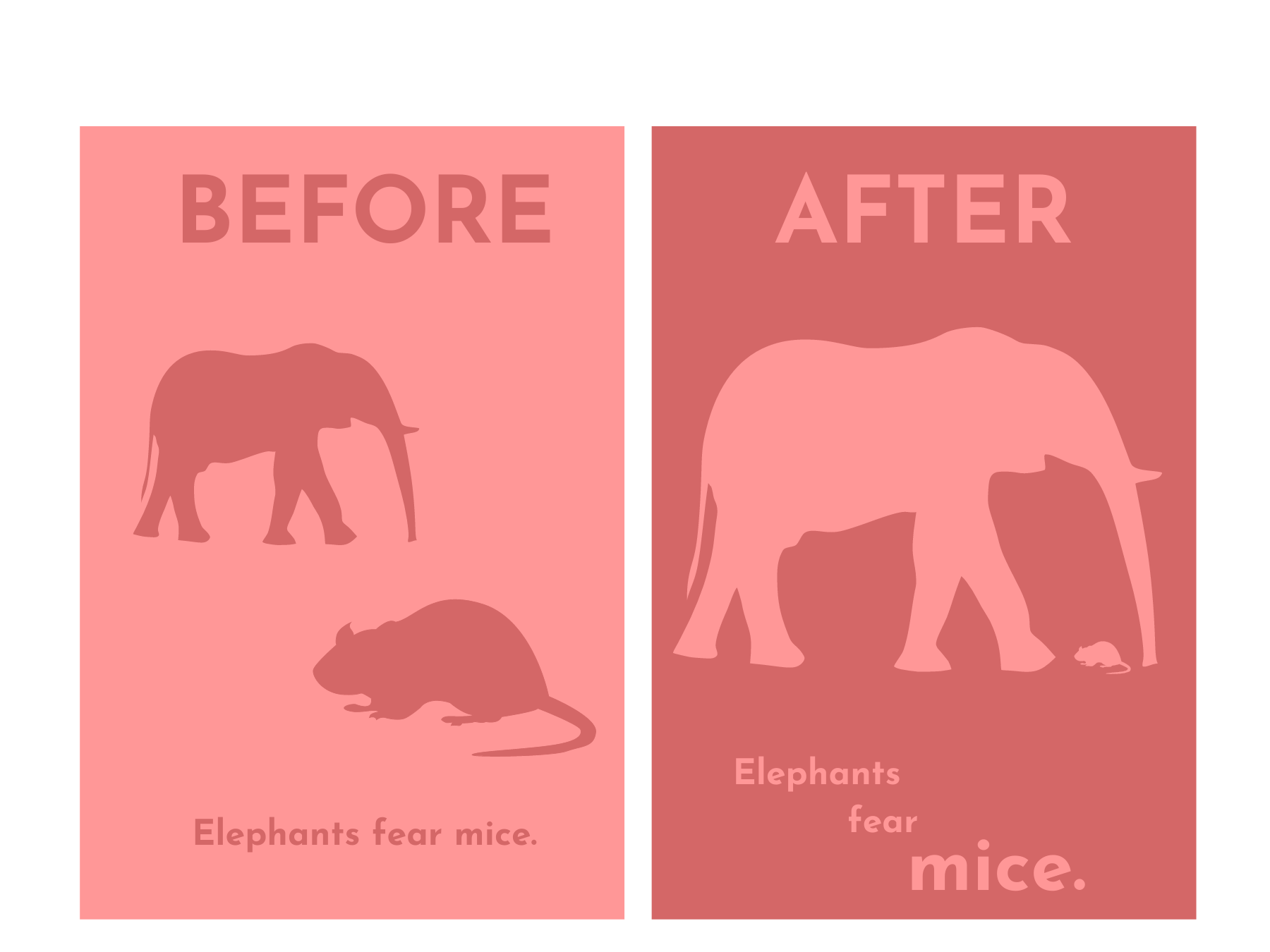
Size
The eye naturally goes to the element that takes up the most space. Give top spot to what matters most. This can be through the use of different sized visuals or by writing more important information in a larger font size.
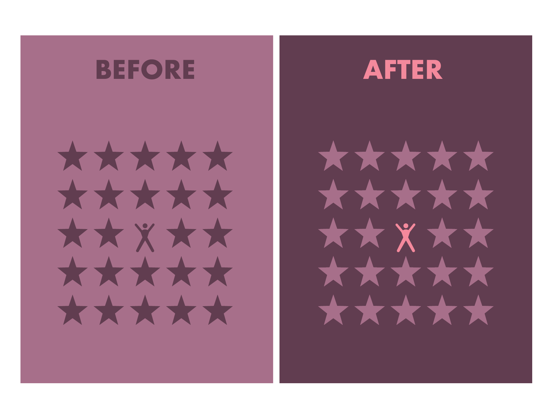
Colour
Highlight important elements by giving them a different colour.
 Use of Space
In design, often less is more. Give your images some breathing room, making them more impactful. Playing with negative space is also a great way to make an impression.
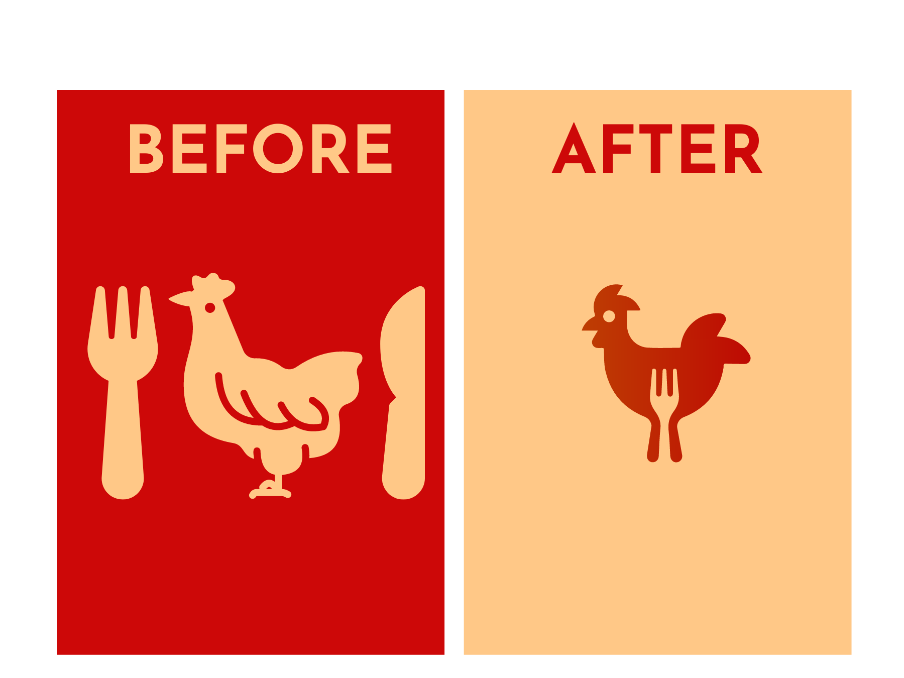
Alignment
Alignment directs the eye to a focal point. Scattered around a page, visual elements like icons and text can get lost. But with the help of alignment, we can establish a sense of direction and establish a clear focal point.
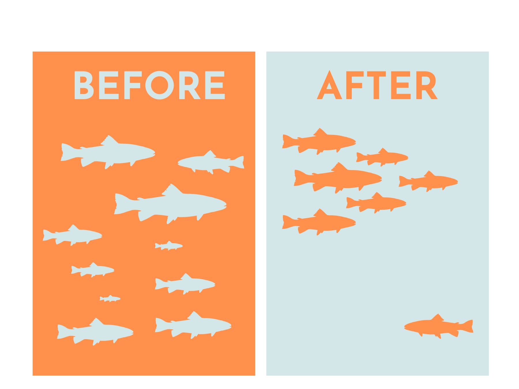
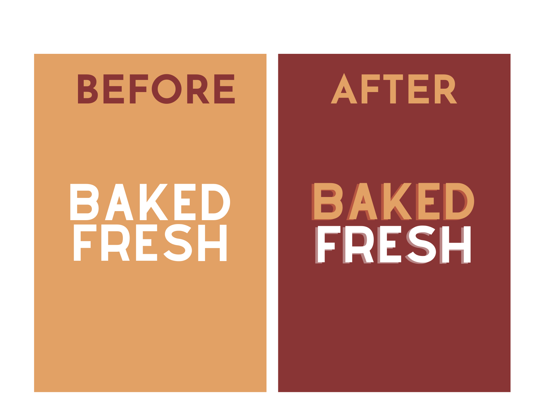
Contrast
Contrast makes designs ‘pop’ and without it, images can look rather flat or cluttered. You can establish contrast in a few ways.
Size
By sizing elements differently, you can create contrast and highlight the most important elements.

Colour:
A pop of colour helps draw the eye in and make your design that much more engaging.
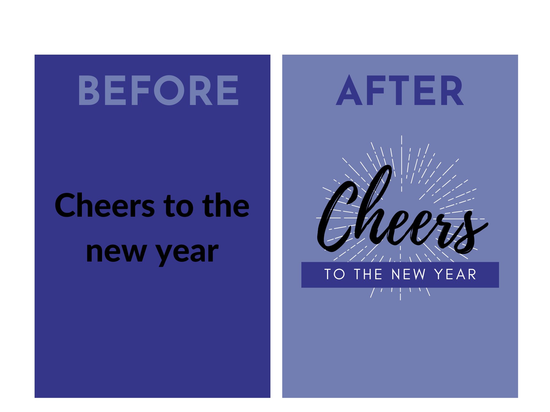
Shape
Contrasting geometric and organic shapes can create visual interest. Using different font styles also helps make your message stand out.
Balance
Balance is essential to good design but is often an afterthought. We might feel that something looks “off” but it’s usually because of a lack of balance. Balance naturally occurs in the world around us and it’s a great foundation for compelling images and graphics.
There are four main types of balance, symmetry, asymmetry, radial and mosaic or crystallographic.
Symmetry
Symmetry is achieved by giving equal weight to elements in an image. The weight can be spread horizontally, vertically, or diagonally. It gives the impression of being mirrored and perfectly balanced.

Image by StockSnap from Pixabay
Asymmetry
Asymmetry occurs when elements in an image are different but equally weighted. Good asymmetrical balance can be a little bit more tricky to achieve but the result can be more striking, playful and engaging than its symmetrical counterpart.

Image by yeshimss from Pixabay
Radial
Radial balance often occurs in nature, think water ripples, tree rings or a snail shell. They draw the eye to the center of the image, to a main focal point. Radially-balanced images are often almost hypnotic and bring feeling of serenity, calm and peace.

Image by msandersmusic from Pixabay
Mosaic or Crystallographic
In mosaic or crystallographic composition, equal weight is given to many different elements across the image. While the individual elements are not symmetrical, the image as a whole is balanced.

Conclusion
This might be information overload, but we’re here to help.
By keeping these few tips in mind, you can ensure that your social media feed offer customers a consistent and reliable visual identity that is reflective of your brand and worth the follow.
By meeting customers where they already spend a lot of time and offering them content that is engaging and appealing. This only stands to strengthen your online community and brand loyalty.
Ready to start putting these tips into practice? Drop us a line and let’s chat!
Did you like what you just read? Then sign up for our weekly digital marketing email newsletter and get the latest tips, insight, and strategies to grow your business online.
6 Ways to Improve Website Conversion Rates Today
- by Alyson Shane
Conversion rates are the most important part of any digital marketing campaign.
That’s what websites are for, after all: attracting an audience and “converting” them into a customer.
Whether you’re a newbie or seasoned digital marketer, knowing how to track and increase your conversion rates is one of the biggest factors in making sure your website is generating new business.
Why do conversion rates matter?
Conversion rates matter because they allow you to track the return-on-investment (ROI) of your marketing and advertising, and can help you spend your budget more strategically.
An effective marketing campaign will get a lot of people to take action and convert, so tracking when users “bounce” away from a page (aka, visit a single page and leave without taking an action) and when they convert can help you make better digital marketing decisions.
What’s the average conversion rate in 2022?
According to WordStream, the average conversion rate for a landing page is 2.35%. However — this stat needs to be taken with a grain of salt.
Conversion rates vary across industries. This makes sense: it’s easier to decide to buy a $10 item than invest $10,000 in a piece of software — which is why this in-depth study by Unbounce spanning 74.5 million visits to more than 64,000 landing pages across a wide variety of industries found that the median conversion rate hovers closer to 3 — 5.5%
If this stat feels intimidating, never fear! Today we’re going to cover some simple steps you can take to start improving your website conversions today.
How to improve website conversion rates today
1. Don’t make people log in
If you have an e-commerce website that always makes people log in, then odds are they won’t be your customer for long.
Think about it: if you had to log into a website every time you wanted to buy something, would you? Or would you order from a website that doesn’t make you remember your email and password every time you want to make a purchase?
Spoiler alert: most of us won’t bother. In fact, a Baymard Institute study found that 37% of users will abandon their cart completely if they’re forced to create an account.
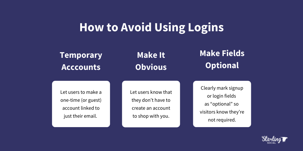
How to avoid using logins
- Allow temporary account creation. Allow users to make a one-time (or guest) account linked to just their email.
- Make it obvious. Let users know that they don’t have to create an account to shop with you. A clickable “check out as guest” button is ideal here.
- Make fields optional. Clearly mark signup or login fields as “optional” so visitors know they’re not required.
2. Personalize or localize content
We love buying things that feel custom-tailored to them and their needs.
People are 91% more likely to shop with a brand that offers relevant offers and recommendations, while 72% say they only engage with personalized messaging and offers.
This can include localized content (content offered based on where they live), content based on past purchases, searches, items they’ve viewed on your site, or ads they clicked on.
How to offer personalized or localized content
- Optimize for local SEO. Make sure to optimize your website content to rank on a search done by someone in your area, since this can help you rank higher.
- Publish relevant content. Share content that users can connect with at various stages of their buying journey and that shows how your product or service solves their problems.
- Personalized discounts. Offer unique discounts to people based on past purchases, their location, or how they’ve interacted with your site.
3. Add more social proof
“Social proof” is a term that’s been around since 1984, when author Robert Cialdini described it as “as people doing what they observe other people doing”.
Basically, your audience isn’t automatically going to believe what you say, so if you’re claiming you can do something then you need to show proof that your claims are true.
Adding social proof to your website is one of the best ways to increase conversions. In fact, a study from TrustPulse found that adding social proof to your website can quickly improve customer trust and increase your conversion rate.
Here are some stats from the study for you to consider:
- 97% of consumers look at reviews before purchasing
- Testimonials can increase conversion rates on sales pages by 34%
- Having at least 5 reviews causes purchase likelihood to increase by a factor of nearly 4X
How to add social proof today
Below are a few quick steps you can take to use social proof to increase conversions:
- Add customer reviews. This is especially true for e-commerce websites which should consider adding a dedicated “reviews” section.
- Include case studies. Case studies are the process of making stories and blog posts out of your successes. They showcase the difference you make and the specific outcomes of working with or buying from you.
- Use social proof pop-ups on sales pages.* Using pop-ups strategically can showcase how often people are buying, leaving reviews, and more. Below is an example from Proof Factor that shows what we mean.
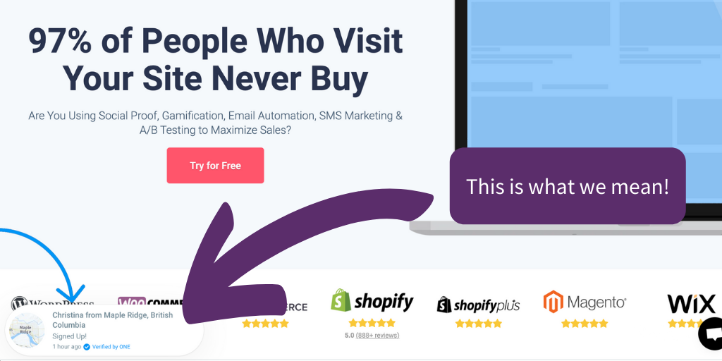
* Important: we suggest using popups sparingly, or in ways that are non-intrusive to someone’s experience using your site. After all, your goal is to highlight how great your business is, not annoy visitors to your website!
4. Do an SEO Audit
Your website could have the best user experience on the planet, but if your website is slow or isn’t getting indexed by Google properly, then your customers won’t even find you.
The more people who visit your website, the higher you’ll rank on a search engine results page (SERP), and the higher your conversion rates will be.
(Looking for info on how to keep your blog posts ranking highly on the SERP? Click here!)
One study found that websites that rank first place on Google have a click-through rate of 31.7%, and another found that only 25% of all users ever bother to click on a website that ranks on the second page of a search result.
This means that making sure your website ranks as high on a SERP as possible is critical to increasing conversions — luckily the fix is simple:
SEO audits will show you where your website could be updated and optimized to help it rank higher. This will allow you to attract more organic (unpaid) traffic and improve those conversion rates.
How to do an SEO audit
- Buy a tool and do it yourself. Services like Ahrefs, SEMrush, and ScreamingFrog are all great tools to help you identify what needs fixing.
- Hire an agency or SEO expert. Ditch the DIY process (which can be time-consuming) and let the pros handle it for you.
5. Shorten your forms
While longer forms can help you learn details about your customers, forms with lots of fields can be annoying and cause people to avoid filling them out at all.
To keep visitors from feeling frustrated and reduce bounce rates on your landing pages, consider including only the most important information in your forms.
Need more proof? Marketo ran a test where they created two forms: a short, and a longer version, and compared their results. They found that a 9-field form conversion rate was 10%, while a 5-field form conversion rate jumped up to almost 14%.
How to shorten your forms
- Only collect essential information. Focus on the most important information (name, email, etc.) and collect everything else in emails, surveys, and follow-up calls.
- Use a 3rd party account to collect information. If you can, give users the option to log in with Google or Facebook so they can stay logged in and you can collect their information automatically.
- Even better: getting people to log in using Facebook can help with your Facebook ad targeting!
6. Keep It Simple, Stupid (K.I.S.S. methodology)
Keeping your forms short isn’t the only thing you can do to increase conversions! Think about ways you can make the experience of visiting your website easier.
Making your website easy for people to use is a cornerstone of modern user experience (UX), as described in this post from CareerFoundry.
In it, they share that people have much shorter attention spans than even just 10 years ago and cite an experiment by Etsy where they slowed down some of their mobile pages to see what would happen — and they saw a 12% increase in bounce rates!
Aka, 12% more people left the page without taking a single action than if the web page had loaded more quickly.
But keeping your website easy to use isn’t just about good UX design and load speeds — WPForms found that a whopping 67% of users will abandon a form if they encounter any issues filling it out.
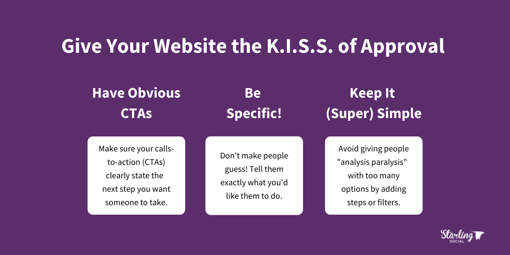
How to give your website the K.I.S.S. of approval
- Have obvious calls-to-action (CTAs). The next step in the buying or contact process should be obvious right away. Don’t make people guess what to do next!
- Tell people what you want them to do. Be specific! Tell them where to click, the information you want them to enter, and how to find specific details.
- Keep it (super) simple. Offering too many options can give people “analysis paralysis” and make them opt out completely. Instead, add steps or filters to help them choose from multiple options.
Improve website conversion rates today
High conversion rates are how you know that your marketing is working, that your website is giving customers what they need, and ultimately how you grow your business.
By applying the strategies listed above you can help your customers have a smooth, seamless buying experience and turn them into repeat customers.
Want articles like this one delivered right to your inbox once a week! Subscribe to our roundup of digital marketing news and be the savviest business owner or marketer in the room.
Facebook Ads in 2022: How to Lower Your Ad Costs
- by Alyson Shane
Facebook Ads can be a great way to increase brand awareness and increase leads and sales — as long as they’re done correctly.
As with any advertising campaign, the key to understanding whether or not your ads are working is to make sure you can earn a decent return on investment (ROI).
To help you make sense of how your Facebook Ads budget is (or isn’t) working for you, we’ve put together this comprehensive guide to Facebook Ads costs. This post will cover:
- Facebook’s four billing models and costs
- How you pay for ads, and how that’s determined
- Plus, a peek at how Facebook’s algorithm works!
Facebook Ads Costs
How you get billed for your Facebook Ads depends on your goal and the type of ad you’re running. There are four main different billing models, which are:
- Cost per click (CPC)
- Cost per 1000 impressions (CPM)
- Cost per action (CPA)
- Cost per engagement (CPE)
Cost per click (CPC)
Cost per click is how much you spend every time someone clicks on your ad. If your goal is to drive traffic to your website, then this is the billing option you should choose.
Facebook loves to automatically select “Impressions” as the default setting for most ad campaign types, so make sure to change this manually so you only get charged when someone clicks on a link in your ad.
As of December 2021, the average CPC cost was $1.17, making it one of the cheapest options out there. This is because you typically need less than 1000 impressions to earn a single click.
If you’re wondering how to keep your CPC costs low, click here.
Cost per 1000 impressions (CPM)
Impressions are how many times a unique user sees your ad.
If a user sees your ad once on the Facebook web browser, then again in the Facebook mobile app, that sounds are two impressions. This option is great if your goal is to increase brand awareness and connect with customers at the top of your sales funnel.
The abbreviation (CPM) is the cost for every 1000 impressions you get — the “M” stands for “mile” and refers to the average cost of every 1000 individual views your ad gets.
For example, if you spend $1000 on a campaign and you get 10,000 impressions, your CPM is $10.
According to Revealbot, the average CPM across all industries in December 2021 was $15.85.
Cost per action (CPA)
Cost per action means you only get charged when someone “converts” by completing an action you choose, like subscribing to your newsletter or downloading an app.
Just like CPM, the number you see in your report is your total ad spend divided by the number of actions completed.
The average CPA (per lead) in December 2021 was $6.79. Just like CPM, this option costs more since it might take hundreds of people seeing your ad to result in a single lead.
Cost per engagement (CPE)
This campaign type optimizes for more likes and engagements on your Facebook posts. Facebook calculates your CPE by dividing your ad spend by the number of likes, shares, reactions, and other engagements your post gets.
As of December 2021, the average CPE was $0.138 — much lower than other options because it’s much easier to get clicks and engagements since any action takes place within the platform (vs. someone clicking through to your website and then having to take a separate action).
Important: while understanding average costs is important, these numbers aren’t necessarily what you will pay when you run your ads. This is because Facebook calculates what you pay based on the impressions you need to generate the results you want.
How are Facebook Ads costs decided?
Facebook Ads uses an AI-based auction algorithm that determines the price of clicks and impressions, which is why the right targeting is so important.
Audience locations, interests, age, ad placements, and more all play a role in determining the cost of your Facebook Ads campaign.
Below are some of the key areas that determine what you pay for your ads:
Audience and demographics
How much you pay depends a lot on the types of people you target.
For example, targeting people aged 25+ costs a lot more than people in the 25-34 range because only 10.6% of all Facebook users are 65+ and often have more money to spend, making them a sought-after target.
Location
Also known as “geotargeting”, this refers to targeting people who live in a specific location. If you’re a local business, you can advertise to a specific group of people in a geographic area.
This option is great for brick-and-mortar businesses, schools and universities, and companies that offer local services like plumbing, HVAC, and home cleaning.
Be aware that some places are more expensive to geotarget than others — for example, Toronto and Vancouver are more expensive to geotarget than Winnipeg or Edmonton.
Objective
When setting up your ads, you can choose from three high-level objectives which are:
- Awareness
- Consideration
- Conversion
Each of these has sub-objectives you can choose from. For example, if you choose “Awareness” your sub-objectives can be either Brand Awareness or Reach.
Objectives like add-to-cart or actual purchases cost more because Facebook’s algorithm believes that these users are already closer to completing a purchase.
Time of year
This probably comes as no surprise: ads cost more during peak shopping seasons (like right now) because more people are running ads and making the marketplace more competitive.
For example, Cost per Impressions (CPMs) jumped 30% in November 2020 as businesses promoted their Black Friday and holiday-related sales.
Industry
For some industries it’s harder to drive a single click or generate a lead, which means ads in these areas will cost more. This happens because some industries have more competition and have sales cycles that might take longer to complete.
For example, it’s pretty easy to advertise a burger combo and get someone to click on the ad if they happen to be hungry, which is why the food and drink industry averaged a CPC of around $0.42 in 2020.
On the flip side, internet and telecom companies paid close to $3.07 CPC because there’s more competition in the space and it’s more expensive than a burger and fries.
Placement
You can show Facebook Ads in six different places across multiple social media platforms:
- Facebook newsfeed
- Facebook right column
- Facebook Messenger
- Instagram Stories
- Audience Network
The more competitive the ad placement, the higher the costs will be. While it varies, generally Facebook ads cost less than Instagram ads.
How does Facebook Ad bidding work?
Facebook’s ads are “auctioned” off to the businesses who bid on specific placements and usually the highest bidder wins the ad placement… but not always.
After all, super-high and aggressive bids don’t necessarily lead to clicks or sales and could hurt Facebook’s reputation. So the platform’s AI considers more than just the bid amount when choosing who wins a particular placement.
How does Facebook’s algorithm work?
Below is an overview of how the algorithm works, followed by the various bidding strategies available to you:
Your bid
Your bid is (obviously) the maximum amount you’ll pay for your bid, but you won’t always pay this amount. Facebook’s system is designed to have you pay the minimum amount you need to beat out other bidders.
For example, if your competitor bids $2.00 and you bid $2.50, Facebook won’t charge you $2.50 — instead you’ll get charged $2.01 for the ad placement.
If you’re bidding for clicks the algorithm will factor in how likely your ad is to get clicks. As an example, even if you bid $1.00 and your competitor bids $3.00, if your ad is likely to get three times more clicks then your ad should win out.
Ad relevance
This plays into your bid since Facebook is also judging how relevant an ad is to a particular audience. Basically what this means is how likely the algorithm thinks it is that your ad will generate a click or other action.
To determine this, Facebook uses a relevance score to judge ad relevance. There are three “relevance diagnostics” involved in this decision:
- Quality ranking. How your ad’s perceived quality compares to similar competing ads.
Things that matter here include user actions (linking, clicking, commenting, etc.) and identifying low-quality attributes like inflammatory language.
- Engagement rate ranking. Your ad’s expected engagement rate compared to ads competing for the same audience.
Important: this excludes “engagement baiting” tactics like asking for likes, comments, and shares.
- Conversion rate ranking. How your ad is expected to “convert” compared to ads with the same goal competing for the same audience. This assesses your landing page and conversion flow, not just your ad.
Spend-based bidding
Spend-based bidding is designed to spend your entire budget and either get the highest value or the most results from your ads.
To accomplish this, Facebook gives you two options:
- Lowest-cost strategy. This aims to get the most conversions for your budget. This opens you up to more bid opportunities, but since you don’t control your bids you might wind up paying more. As a result, this option is ideal if you don’t have specific cost-per-action (CPA) requirements.
- Highest-value strategy. This aims to spend your entire budget and get the highest value purchases, vs. trying to get the highest number of purchases. This option works great if your goal is to target “big spenders” instead of the largest number of customers as you can.
Goal-based bidding
Goal-based bids allow you to set specific cost goals in order to maximize certain actions or results.
There are three options here:
- Lowest cost. This is the default setting where you have no cost control and where the algorithm will maximize the results of your budget.
- Cost cap bidding. This option sets a target cost-per-action (CPA) that you want Facebook to stick close to. For example, you could set a target cost per purchase to maintain a specific profit margin on each conversion.
- Minimum return-on-ad-spend (ROAS) bidding. This option allows you to set a target for the minimum return on ad spend (ROAS) you want for each bid. This can feel complicated since it’s determined in decimal points. For example, if you want to earn at least $150 for every $100 spend on ads, you’d set a 1.500 ROAS control.
Manual bidding
Manual bidding is exactly what it sounds like: Facebook allows you to control how much you bid across all your auctions instead of the algorithm handling it for you.
Since the algorithm needs a large enough data set to spend the ad budget efficiently, this option can be great for businesses with smaller, niche audiences.
Lowering Facebook Ads costs: best practices
Now that we’ve covered the basics of how Facebook Ads cost, let’s take a look at some steps you can take to improve your return-on-investment (ROI):
Define your audience
Your targeting is the most important factor in whether your ads do well or not.
Start by doing customer research and create Custom Audiences and Lookalike Audiences by tweaking your targeting using the options available to you.
The more defined your audience is, the more relevant your ads will be and the lower your costs can become.
Use Lookalike Audiences
A “lookalike” audience is exactly what it sounds like: it’s a group of people with similar characteristics or who have taken similar actions to people in your target audience.
You can create Lookalike Audiences by using a Custom Audience as a “source” or by using the Facebook Pixel to collect data. The algorithm then uses that data to find new potential audiences.
Switch out your creative
Don’t be afraid to experiment and change up your ad creative (the images, text, etc.) in the ad.
Experimenting not only helps you understand what types of ads appeal to your audience but can bring your costs down people will click on ads that appeal to them.
Once you have something that works, use it as your “control” ad but make sure to keep testing new versions to keep your costs low and reduce ad fatigue, which is when people start “glossing over” an ad because they’ve seen it too many times.
Align ad creative and ad placement
Pay attention to the dimensions available across different ad placements and create images or videos that “fit” with each place you plan to run your ad.
For example, a Facebook newsfeed ad should look different than an Instagram Story ad.
Use retargeting
Retargeting is when Facebook puts ads in front of people who have already interacted with your business in some way, like viewing a specific product page.
Not only can you show ads to people who have visited a specific page, but you can run promotions to existing subscribers, previous customers, and more.
Use strong calls-to-action (CTAs)
Make sure to always include a CTA in your ads! Calls-to-action is text that tells the reader the specific action you want them to take. One example could be: “get free shipping when you order before January 1st!”
If your Facebook Ads still aren’t delivering, try using one of these strategies to solve it.]
Lower Facebook Ads costs in 2022
Understanding how Facebook’s algorithm works, common mistakes people make, and how ad costs are calculated is critical to running a successful ad campaign on the platform.
Above all: don’t be afraid to regularly test and experiment with your ads! Investing time to understand what your audience loves (and doesn’t love) will help you develop campaigns that earn you a great return-on-investment (ROI) and generate positive brand awareness for your business.
If you’d like to work with experts who can create eye-catching Facebook Ads for you, drop us a line and let’s chat.
Want to stay in the know about the latest digital marketing news, tips, and strategies? Subscribe to our weekly email newsletter!
How to Build a Community Around Your Brand
- by Alyson Shane
By: Alyson Shane, President
Brand communities are the easiest way to increase trust and familiarity with your brand, increase sales and conversions, and have better conversations with your customers.
Customers are looking for deeper and more meaningful interactions with the businesses they support. This is especially true in light of the last few years when topics like diversity and inclusion, sustainability, and voting with your dollar have become part of the mainstream conversation.
These days, consumers are looking for brands that share their values.
To help you better understand what brand community is, why it’s so important for your business, and how to build a successful one, I’ve put together this guide to help you get started.
What is a brand community?
Let’s clear the air: brand awareness is not the same as a brand community.
A brand community is when people are emotionally invested in buying your products or services, engaging with your content, and actively telling their friends and family about your business.
These people follow everything you do on social media, share your content with their followers, promote your products and services without being asked to, and are “ride or die” fans of your business and what you do.
Unlike brand awareness, which is simply when someone knows about your brand, your brand community is made up of people who have an emotional connection to your brand.
What’s the benefit of building a brand community?
Put simply, a brand community is a powerful tool for growing your business.
According to SmallBizGenius, 56% of customers will stay loyal to a brand they feel “gets them”, which means building a community around your brand can help existing customers feel aligned with your business.
Even better: HubSpot found that 81% of consumers trust the advice of family and friends over businesses, which means if someone is a member of your brand community you’re in a better position to get referral and word-of-mouth business through your existing customers.
Having an active brand community also means that you have a group you can regularly tap into to get feedback on new products or services, share blog content, test new features (if you’re a SaaS business), and use to collect positive testimonials and feedback.
However — a brand community isn’t a one-way street. The key to a successful brand community is to consistently find ways to engage, entertain, and reward your community members.
Let’s talk about how to do that:
How to build a community around your brand
1. Define your brand’s mission, values, and personality
Before you build a community around your brand, you need to know what your brand is. This goes beyond the products and services you sell, and should include:
- What’s your company’s vision?
- Who are your customers, and how do you solve their problems?
- What’s your brand voice, and how does it change in different contexts?
- What do you want your brand to be known for?
If you’re not sure how to define these areas (or if you haven’t updated them in a long time) a digital marketing consultation can help clarify your vision.
2. Don’t try to be everything to everyone
”'By being everything to everyone you're nothing to anyone” — there are tons of variations of this quote, but they all make the same point: leaning into causes or messaging that’s outside of the scope of your brand dilutes our message and makes it harder for people to connect with you.
3. Decide where your content hub will be
Members of your community will need a place to come together to engage with your brand, share information and share their experiences.
Consider your audience’s needs, demographics, preferences, and how they want to interact with your brand and other members. If you’re not sure which is best for your brand community, take a look at a few of these options:
A community forum
Forums are a great way for large communities to talk about shared interests (which may or may not be directly relevant to your brand). A great example of a successful community is Spotify’s community.
Image via Spotify Community
You can see that their home page gives people the option to ask for help and engage with the brand, chat with other users, or engage with the community through polls and posts.
Since Spotify is a huge music streaming company with a global audience, a forum works great as a community hub because the brand can cultivate conversations around playlists, emerging artists, and more, all with their music streaming platform positioned at the center.
Social media
There are two ways to create a brand community on social media: by engaging through your profile, or by creating a group.
You can also create communities around a branded hashtag, which is exactly what it sounds like! Branded hashtags are hashtags that are unique, either to your brand or to a specific campaign on social media.
One example is Disney’s #ShareYourEars campaign which was created in collaboration with the Make-A-Wish foundation. Every time someone posted a photo of themselves wearing Mickey Mouse ears with the hashtag #ShareYourEars, Disney donated $5 to the charity.
Image via Instagram
4. Lean into user-generated content (UGC)
Another example of how to build a brand community on social media is to create a generic branded hashtag like A Color Story has done.
They feature photos posted using the branded hashtag #AColorStory on their feed, which builds brand loyalty and helps generate user-generated content (UGC) on their feed as well, which keeps it personal and informal.
Image via Instagram
5. Create high-quality content
Use customer research to create content that your audience will love. Some examples of content you can create include:
- Writing helpful tutorials
- Publishing interesting articles
- Co-creating content with influencers
- Answering customer questions in Q&As (live or pre-recorded)
Encourage your community members to get involved by sharing their opinions and thoughts in the comments section, or by using fun engagement tools like Instagram Story Stickers like polls, “Add Yours” and “Question”.
Creating a space where your community members can find helpful, interesting, and relevant content that creates an emotional connection to your brand is the key to getting them to come back over and over!
6. Lead from the top down
One of the easiest ways to create a community around your brand is for the people at the top (President, CEO, and other leadership) to be actively involved with promoting the brand and its values.
This is especially true for small-to-medium-sized brands where being personable and relatable can play a huge role in differentiating you from the competition. Some ways that leadership can help build a community include:
- Showing up regularly in Stories, Reels, and behind-the-scenes content
- Writing op-eds, post captions, and email newsletters from their own perspectives
- Blogging or publishing content on their own social media channels that aligns with the brand
- Resharing company updates on their own social media profiles
- Volunteering and doing philanthropic work that’s reflective of the brand’s values
Start creating your own brand community today
Engaging with your customers and potential customers makes them feel important to the brand itself. This increases loyalty and trust and fosters positive feelings about your business that can be hard to achieve without a strong community.
Ready to start building a community around your brand? Drop us a line and let’s chat!
Did you like what you just read? Then sign up for our weekly digital marketing email newsletter and get the latest tips, insight, and strategies to grow your business online.
How to Publish LinkedIn Articles: Best Practices
- by Alyson Shane
By: Alyson Shane, President
Publishing articles on LinkedIn is one of the best tools at your disposal to position yourself as a subject matter expert, keep your name top-of-mind, and generate leads for your business.
Recently, Hubspot found that LinkedIn is 277% more effective at generating leads than Facebook and Twitter.
This means that if you run a business or have ambitions to get known by the broader professional community in your area, LinkedIn is the number one place to do it.
But it’s not enough to just publish posts to your profile — the secret to being successful on the platform lies in regularly publishing LinkedIn articles.
What are LinkedIn articles?
A LinkedIn article is a piece of long-form content that you can create and share through LinkedIn’s internal publishing platform.
LinkedIn articles are like blog posts published just to LinkedIn, and offer the opportunity to share your insights and expertise with your connections and the people in your industry.
LinkedIn article publishing best practices
Make your titles between 40 - 49 characters long
According to research from OkDork, articles with titles between 40 - 49 characters earned the greatest number of post views overall.
This is important if you’re republishing your blog posts from your website to LinkedIn, since Hubspot found that the ideal blog post title length is 60 characters.
With this in mind, you might want to consider creating some alternate titles for your LinkedIn posts if your original titles are a bit too long for the platform.
Use “how-to” and list-style headlines
This tracks with other data we know about blog posts, which is that 36% of readers prefer list-based headlines.
According to research from OptinMonster, “how-to” headlines are the third most popular headline preference at around 17%.
When it comes to LinkedIn articles specifically, OkDork’s data showed that LinkedIn readers clicked on articles that included “How” in the title 45% more often than posts with titles that didn’t include the word “How”.
Titles like these have been popular since forever (seriously, it feels like I’ve been giving this advice since I started publishing content +20 years ago) because they tell the reader exactly what to expect from the piece.
Taking the guesswork out of what a reader can expect increases the likelihood that they’ll take the time to read what you’ve written.
Write long-form content
When it comes to LinkedIn articles: longer is better.
The best-performing blog posts should be 2100 - 2400 words, users on LinkedIn prefer posts that are about the same length: ideally, between 1900 - 2000 words.
One reason for this is because LinkedIn readers expect content that is well-researched, insightful, and useful — something that’s almost impossible to achieve in a 500-word post.
Important: this doesn’t mean you should “pad” your post with fluffy sentences or extra paragraphs just to hit a word limit. People will realize that what they’re reading isn’t providing real value and will simply click away, or even worse: will stop reading your posts overall.
Include images
Images help break up your text and increase readability by giving the reader a visual “break” from big walls of words.
This is especially true if your audience is reading your post on a mobile device, which in LinkedIn’s case is about 20% of all monthly users (about 63 million unique monthly users, to be exact).
While images directly relating to your text are ideal (and make great social media shareables), the right stock image can go a long way towards helping people digest a long post.
Some great sites for finding free stock images are Pexels, Unsplash, and Pixabay.
Write for an 11-year-old
Data shows that most adults read at an 8th-grade level, which means that if your content is too hard to read, people will simply “tune it out” and not finish reading what you have to say.
If this sounds intimidating, take a look at a few books written for this level:
- The Harry Potter series
- most books by Tom Clancy
- most books by John Grisham
- The Great Gatsby
What does it mean to “comprehend” text?
A person who reads below an 8th-grade level could read a book or an article written for a higher level of comprehension, but they won’t understand much of what they read.
- Reading is looking at and interpreting written text
- Comprehension is understanding the meaning behind those words
Now, you might be saying “but Alyson, my audience are all smart, educated, and good-looking people!” (ours are, too) but writing for a higher reading level means that fewer people will be able to understand what you say.
While writing for this level might feel patronizing, think about it another way: writing for an 8th-grade reading level means that everything you publish is simple and easy to understand.
Publish consistently
Social media in general is all about consistency, but it’s especially true when it comes to publishing long-form content like LinkedIn articles.
Here’s why:
The algorithm prefers consistency
The algorithms that power social networks like LinkedIn, Instagram, etc. prioritize showing content from accounts that deliver “value” to their followers.
One of the metrics that algorithms see as “valuable” is consistency in posting, since your audience are likely to both expect to hear from you, and statistically more likely to interact with your posts when they see them. You’ll see increased engagement
Just like I said above, you’ll get a boost in visibility when you post consistently because that’s what the algorithm prefers, but publishing regularly also helps more people find, read, and follow what you share.
If you post once, then don’t publish anything again for a few months, the people who read your first article and might have been interested in what you said will have moved on.
On the other hand, if people expect to hear from you on a regular basis they’ll not only look forward to your content, but will actively look for your content.
You’ll stay top-of-mind
Publishing articles regularly means that your name will keep popping up in front of people who’ve connected with you. Staying top-of-mind means that when someone needs a service you offer, you’ll be the first person they think of.
(Anecdotally, I can’t begin to tell you many how many people say they know me “from my articles on LinkedIn”.)
Vary your topics
Topics like leadership, productivity and efficiency are all overplayed on LinkedIn, which means people are more likely to gloss over your piece if you write about them.
There’s already been so much said on these subjects that it’ll be hard to say anything new or groundbreaking which risks your article sounding generic or repetitive.
Instead, try writing about topics like:
- How-to’s and instructional pieces
- Trending topics in your industry
- Personal stories and anecdotes
Choose the right hashtags
Choose hashtags that are suited for a business-focused audience when creating a post to promote your new article — no #blessed hashtags here, please!
If you’re not sure which hashtags to use, LinkedIn’s post editor will suggest some for you to choose from.
Make sure not to overdo it on the hashtags or your post will look spammy. Unfortunately, some people make the mistake of cross-posting from their Instagram account and winding up with a post that has a block of hashtags that looks like this:
(These are hashtags I copied from a real post just now. Yikes!)
For reference, Sendible recommends using no more than three to five hashtags per post.
Cross-promote your blog
This is a power move! Publish your articles to your company’s blog, then re-publish them to LinkedIn as LinkedIn articles and link back to your website in your piece.
This makes it more likely that people will click through to your website to learn more about you and the services you offer.
Here’s an example of how to do it:
“This post was originally published on the Starling Social blog — check out more of our how-to articles by clicking here.”
Start publishing LinkedIn articles today!
Now that you know what to do, it’s time to start publishing your LinkedIn articles and watching your connections grow on the platform.
Using LinkedIn articles strategically will help you get in front of your target audience, attract views to your posts, increase referrals, and more.
If you’re not sure what to write about, drop us a line and let’s chat about our copywriting services can take it off your plate.
Interested in getting the latest digital marketing news and strategies sent right to your inbox once a week? Sign up for our newsletter!
How We Develop Our Weekly Digital Marketing Email Newsletter
- by Alyson Shane
By: Alyson Shane, President
Email newsletters are one of the most important aspects of a successful digital marketing strategy. As subscription-based models, they’re great at driving brand awareness, increasing visibility, and creating opportunities for brands to communicate consistently with their target audience.
While some email newsletters are promotional in nature — letting you know about a new product or service, for example — but some newsletters are educational in nature. They offer insights that help educate the reader, which builds brand credibility and authority.
Today I’m going to be talking about Starling Social’s weekly digital marketing newsletter. I’ll cover why I chose the frequency, topics, share my process, and end with some email marketing best practices so you can start creating your own.
Some background on newsletters
I’ve been publishing content online for over 20 years, which means that I’ve seen a lot of digital marketing trends come and go.
Email has been around since the 1980’s but it didn’t start to become popular until 1996 when companies like Hotmail and RocketMail started offering free webmail services that didn’t need specific software to use.
Now we could send and receive emails easily… but that also meant that unwanted messages started to become a real problem. It got so bad that in 1998, spam was added to the New Oxford Dictionary.
As an aside: many people believe that using “spam” to describe junk email comes from a classic Monty Python skit that features eaters at a diner being bombarded with annoying repetitive lyrics about “spam” which none of them like or want.
Why have an email newsletter?
As a marketing tool, email newsletters are worth their weight in gold.
Email marketing has an average return-on-investment (ROI) of 42:1, meaning that for every $1 dollar you spend, you can expect to get an average of $42 back in future sales.
Why are emails so powerful? Because everyone uses email.
Millennials use email the most, with a study by Adobe finding that people born between 1981 and 1996 spend a whopping 6.4 hours a day in their inboxes, with 41% checking their email in bed and before and after work and people over that age spend 5 hours a day on email.
That’s a huge time window to get in front of your audience!
Why a weekly newsletter?
The best frequency for newsletters is no more than twice a week and at least once a month. In fact, more people are reporting that they want to hear from brands they care about on a regular basis:
“61% of consumers want to see at least one email a week from brands they follow.”
The data tells me that a weekly newsletter is what my audience likely wants in terms of frequency.
Why focus on digital marketing news?
Knowing how often to send our email newsletter is great and all — but what about the content?
I wanted to create an email newsletter that was useful and purpose-driven, and that I would want to read if it were showing up in my inbox.
I also knew that lots of business owners and marketing managers struggle to keep up with the latest news in their industry. Things move so fast that it can feel overwhelming to try and keep track of it all, so I decided to collect the information I was seeing online and combine it into a single weekly update.
As a result, our newsletter is broken up into these sections:
- News. This section covers new or upcoming features, new products or tools, and other timely information
- Resources. A roundup of the best “how to” and informational articles from the past week
- Extra goodies. A fun, interesting, or weird article to keep things spicy
This has an added benefit for me: as the owner of a digital marketing agency, I have a responsibility to be as up-to-date on the latest marketing news and best practices.
Personally curating and writing our weekly email newsletter means I’ve always got my thumb on the pulse of my industry, which helps me and my team deliver better results four clients.
Why do I send our email newsletter on Tuesdays?
Technically Monday, Wednesday, and Friday are the best days to send emails, but I decided to send Starling’s email newsletter every Tuesday morning.
This is partially to give myself room to include any news that might have happened over the weekend, but it’s mostly because I don’t want to send our subscribers something that feels like another to-do first thing Monday morning.
Luckily for me, it seems like this strategy is working. At the time of writing our email newsletters have an average open rate of 34.6%, which is higher than the industry benchmark of 17.38%, and average click-through rate of 5.7%, which is above the industry average of 2.4%.
How I develop our weekly email newsletter
I use four tools to help me curate, write and send our newsletter each week, which are:
- Feedly
- Trello
- MailChimp
- Grammarly
Feedly is an RSS reader that I use to aggregate digital marketing news from various sites online.
I check Feedly once a day, and again every Monday morning before I start drafting the newsletter to make sure I haven’t missed anything over the weekend.
Trello is the project management tool we use at Starling Social and I swear by it. In addition to having Trello boards for all of our clients, I have a private, “Starling Social” specific board, which is where I keep track of the things I have going on with the business.
Trello uses a kanban-style system to track tasks on “cards”, so I created a template card for the email newsletter that looks like this:
I create a new card every Monday after I’ve finished scheduling the newsletter, move it to my “doing” column in Trello, and add to it throughout the week.
Since I check Feedly every day and read a ridiculous amount of articles online, after a few days my card starts to look like this:
MailChimp is where I draft, test, and send our email newsletters. My process here is pretty simple:
- Open two windows: one with the corresponding Trello card, and one with my MailChimp draft — this is just a personal preference so I tab over less often.
- Update the subject line and preheader. I like to use our preheader as an additional call-to-action (CTA) to entice people to open the email.
- Update the headers so they match the new articles we’ll be sharing.
- Fill in the body text. I like to add commentary instead of copy/pasting from the article so our subscribers get a sense of our brand’s personality (and also mine).
- Copy/paste it into Grammarly to make sure it doesn’t have any glaring typos or grammatical errors.
- Read it out loud. This is my #1 rule for writing and I’ve practiced it since my blogging days. Reading your work aloud helps with clarity, brevity, and sentence structure.
- Preview the email to check how it will appear on mobile and across different devices.
- Send a draft to myself. Another rule! This way I can double check my subject line, preheader, and email body all look and sound the way I want it to sound.
- Schedule it to send the next day.
It’s that simple! A few steps every week and I have a fun, useful, and (apparently) popular weekly digital marketing newsletter ready to go.
Protip: I like to post on social media about our newsletter once I’m finished scheduling it and link to our subscription page so people can get in on that week’s send if they want. You’d be surprised at how well this works!
Email newsletter best practices
Now that I’ve spent some time talking about my process, let’s review some email newsletter best practices so you can start sending emails that your audience loves to read:
Let subscribers know what to expect. Clear expectations help you find subscribers who will be more engaged with your emails. There are two places where you can do this:
- On your website, either on a subscription page or in a popup
- In your welcome email, where you can reiterate what subscribers get from signing up
Always Be Testing (ABT). A/B test different subject lines, send times, and content layouts to figure out what your subscribers like best and continually optimize towards whatever’s yielding the best results.

Keep your subject lines catchy. 35% of people say they’ll open an email based on the subject line alone. Here are some tips to get you started:
- Keep it brief, no more than 9-10 words
- Use relevant emojis to catch people’s attention
- Be clear about what’s inside the email
- Use language that sparks one of these four emotions:
- Happiness
- Excitement
- Curiosity
- Urgency
Use your preheader as a call-to-action (CTA). Preheaders are your second chance to convince someone to open your email, so be strategic in how you use them.
Never pre-schedule your drafts in advance. Always leave your email newsletter as a “draft” until it’s ready to send. Otherwise you risk this happening:
Choose the right length. Starling Social’s weekly newsletter is longer by default because we’re including write-ups about the article we’re sharing, but longer isn’t always better. Here’s how to choose the right length for your email:
Short newsletters are great for redirecting to a bigger piece of content — a single blog post, webinar, video, registration or product page.
Longer newsletters tend to be either informational (like ours) or promotional, like the kind you’d get from an ecommerce brand.
Optimize for mobile. About 46% of all emails are read on mobile devices, so keep the size of the screen in mind when crafting your email newsletter. Some best practices include:
- Avoid large blocks of text
- Avoid large images
- Make CTA’s clear on their own line or button
- Preview it for mobile and across devices before sending it
Be strategic with your open times. Data shows that emails are best sent at either 10:00 AM, or 1:00 PM, but I suggest starting with these times, testing, and adjusting based on your results.
As an aside: I send our email newsletter at 8:15 AM and have been getting better open rates than when I sent it later in the day. Like I said: test, test, test!
Use this process to maximize your email marketing ROI
Figuring out how to create an email newsletter that people want to open and read on a regular basis takes time, patience, and process.
But email newsletters are also a great way to generate awareness, create trust and brand authority, and stay top-of-mind among your most engaged potential customers.
Now that you’ve read all about how I develop Starling Social’s weekly digital marketing email newsletter, you can take these tips and apply them to your campaigns.
And hey — if you’d like to stay up-to-date with the latest news and strategies (like this post) just subscribe to our newsletter and get ‘em sent right to you every Tuesday morning.
